Common data visualization mistakes in student papers
Princeton Journal of Pre-Collegiate Research
Common data visualization mistakes in student papers
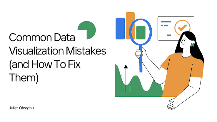
Most high school researchers spend weeks collecting and analyzing data, then lose reviewers in the final step: presenting it. This post identifies the most common data visualization mistakes in student papers, explains why each one undermines an otherwise strong submission, and gives concrete fixes. It is written for students in grades 9 through 12 who have completed data collection and are preparing a manuscript for peer-reviewed publication. When your paper is ready, the Princeton Journal of Pre-Collegiate Research publishes original student research across all academic disciplines.
What are the most common data visualization mistakes in student papers?
The four most common data visualization mistakes in student papers are: choosing the wrong chart type for the data, omitting axis labels or units, presenting raw counts when proportions are more informative, and including figures that duplicate information already stated in the text. Each mistake signals to reviewers that a student has not yet distinguished between exploring data privately and communicating findings to a public audience.
Peer reviewers at academic journals evaluate figures by a single standard: does this visualization make the finding clearer, or does it make the reader work harder? A figure that fails that test is not a neutral element. It actively weakens the paper's credibility.
The mistakes below appear repeatedly in submitted manuscripts. Understanding them before drafting your figures will save revision cycles and strengthen your submission considerably.
Choosing the wrong chart type. Bar charts are appropriate for comparing discrete categories. Line graphs communicate change over time or across a continuous variable. Scatter plots show relationships between two continuous variables. Pie charts are appropriate only when the parts genuinely sum to a meaningful whole and there are fewer than five categories. Students frequently use bar charts for continuous data or pie charts for datasets with eight or more categories, producing figures that obscure rather than reveal the pattern. The choice of chart type is not aesthetic. It is analytical.
Missing or incomplete axis labels. A figure without labeled axes cannot stand alone. Reviewers should not need to read the caption or the body text to understand what the x-axis and y-axis represent. Every axis must carry a descriptive label and, where applicable, a unit of measurement in parentheses. A label reading "Score" is insufficient. A label reading "Reading Comprehension Score (points, 0-100)" is complete.
Presenting raw counts instead of normalized values. If a study compares two groups of unequal size, reporting raw counts misleads the reader. A group of 200 students producing 80 correct responses and a group of 40 students producing 30 correct responses look different in raw numbers but are not directly comparable without normalization. Proportions, percentages, or rates are almost always more informative when group sizes differ. For guidance on how statistical choices affect what reviewers accept, see the journal's resource on common statistical mistakes in student papers.
Redundant figures. A figure that shows exactly what a preceding paragraph already states in prose adds length without adding information. Each figure in a research paper must present something the text cannot convey as efficiently in words alone. If the finding can be fully communicated in one sentence, a figure is not needed.
What separates a publishable figure from a well-made class chart?
A chart produced for a class assignment is designed to demonstrate that a student can represent data. A figure in a peer-reviewed paper is designed to prove a claim to a skeptical reader who has no prior investment in the finding. That distinction changes every decision about how a figure is built.
Publishable figures include error bars or confidence intervals wherever the data involves measurement or sampling. A bar chart showing group means without error bars tells the reader nothing about variability or statistical reliability. The National Institutes of Health style guidance for scientific figures explicitly requires that measures of variability accompany all summary statistics in graphical form. Students who omit error bars are not making a formatting error. They are omitting evidence.
Publishable figures also use consistent visual encoding. If blue represents the experimental group in Figure 1, blue must represent the experimental group in every subsequent figure. Inconsistent color or symbol use forces the reader to re-learn the legend for each figure, which signals a lack of editorial control over the manuscript.
Caption quality is another separator. A class chart caption might read: "Figure 1: Test scores by group." A publishable caption reads: "Figure 1: Mean reading comprehension scores for the intervention group (n = 45) and control group (n = 43) at baseline and eight-week follow-up. Error bars represent one standard deviation. Asterisks indicate statistically significant differences at p less than 0.05." The caption must allow the figure to stand alone, fully interpreted, without reference to the body text.
Students preparing submissions can review how published student authors have handled figures by browsing published research in the PJPCR archive to see how accepted papers present quantitative findings.
What are the most common data visualization mistakes students make when preparing figures for peer review?
Beyond chart type and labeling, three additional mistakes appear frequently in manuscripts submitted to student journals, and each one is avoidable with a single targeted check before submission.
Decorative elements that distort data. Three-dimensional bar charts, gradient fills, and shadow effects are default options in many spreadsheet programs. They are not appropriate for academic figures. A three-dimensional bar chart introduces visual depth that has no relationship to the data, making it difficult to read precise values from the chart. The American Psychological Association Publication Manual, sixth and seventh editions, explicitly advises against three-dimensional effects in research figures. Students should use flat, two-dimensional charts with a white or transparent background.
Inconsistent scales across figures. When two figures in the same paper use different y-axis scales to display similar data, a reader comparing them will draw incorrect conclusions about the relative magnitude of effects. If Figure 2 shows a y-axis from 0 to 100 and Figure 3 shows a y-axis from 60 to 80 for the same type of outcome measure, a visually similar bar height in each figure represents a very different value. Scales must be consistent across figures that a reader will compare.
Figures produced at low resolution. Figures exported from spreadsheet software at screen resolution (72 dpi) are not suitable for publication. Most journals require figures at a minimum of 300 dpi for print and digital archiving. Low-resolution figures appear blurry in the published PDF and are frequently flagged during production review. Export figures at the highest available resolution and confirm the file size is consistent with a high-quality image before submitting.
For a broader review of manuscript errors that recur across disciplines, the journal's guide to common mistakes to avoid covers additional categories beyond visualization.
How to prepare figures for a peer-reviewed submission, step by step
List every figure you plan to include and write one sentence explaining what claim each figure supports. If you cannot write that sentence, the figure may not be necessary.
Confirm the chart type matches the data structure: categorical comparisons use bar charts, time-series data uses line graphs, relationships between continuous variables use scatter plots.
Label every axis with a descriptive name and a unit of measurement. Check that the label is legible at the size the figure will appear in the manuscript.
Add error bars, confidence intervals, or standard deviation markers to any figure that displays summary statistics such as means or medians.
Remove all three-dimensional effects, gradient fills, and decorative shadows. Use a plain white background.
Verify that color and symbol encoding is consistent across all figures in the paper. Write a legend that is self-explanatory without reference to the text.
Write a complete caption for each figure. The caption must allow the figure to be fully interpreted without reading the surrounding paragraphs.
Export each figure at 300 dpi or higher. Confirm the file is not blurry when viewed at full size.
Read the submission guidelines for figure formatting requirements before uploading your manuscript.
PJPCR accepts original research across all academic disciplines. If your manuscript includes quantitative findings and your figures meet the standards described above, review the full submission guidelines at princeton-jpcr.org/submit.
Frequently asked questions about data visualization in student research papers
What is data visualization in a research paper?
Data visualization in a research paper is the use of charts, graphs, tables, and figures to present quantitative or qualitative findings in a format that communicates patterns more efficiently than prose alone. Effective visualization makes a finding immediately legible to a reader who has not seen the underlying dataset. It is not decoration. Every figure must serve a specific evidential function within the argument of the paper.
How many figures should a high school research paper include?
Most peer-reviewed student papers include between two and six figures, depending on the complexity of the findings. There is no minimum requirement. The correct number is the number of figures that each present something the text cannot communicate as efficiently in words. Reviewers will flag figures that duplicate prose or that present findings too minor to warrant a standalone visual. Quality and necessity matter more than quantity.
Do I need statistical software to make publishable figures?
No. Many published student papers include figures produced in Microsoft Excel, Google Sheets, or free tools such as Datawrapper or Canva for Education, provided the figures meet labeling, resolution, and formatting standards. Statistical software such as R or Python produces higher-quality outputs and is worth learning, but it is not a prerequisite for submission. The standard of the figure matters more than the tool used to produce it. For help identifying datasets to visualize, see the guide to free datasets every student researcher should know.
What makes a data visualization publishable rather than just accurate?
A publishable figure is accurate, but accuracy alone is not sufficient. A publishable figure is also self-contained: a reader can interpret it fully using only the figure and its caption, without reading the surrounding text. It uses the correct chart type for the data structure, displays appropriate measures of variability, maintains consistent visual encoding across the manuscript, and is exported at print-ready resolution. Reviewers assess figures by whether they advance the paper's argument, not merely whether they display data correctly.
What kinds of research does PJPCR publish, and how does the peer review process work?
PJPCR publishes original research by pre-collegiate students across the sciences, social sciences, humanities, and interdisciplinary fields. Submission and peer review are free. A publication fee applies for accepted papers. The standard review timeline is 2 to 3 months. A fast-track option is available for students who need a quicker turnaround. All submitted manuscripts undergo rigorous peer review by qualified reviewers. Review the full peer review process before submitting to understand what reviewers assess at each stage.
What to do next
Data visualization is one of the most visible components of a research manuscript, and common data visualization mistakes in student papers are among the most frequent reasons reviewers request major revisions. The fixes are concrete: choose the correct chart type, label every axis completely, include measures of variability, remove decorative formatting, and write captions that allow each figure to stand alone. A manuscript with clear, honest, well-formatted figures signals to reviewers that the researcher understands the difference between exploring data and communicating findings.
If your figures meet these standards and your manuscript is ready for peer review, submit your research to PJPCR at princeton-jpcr.org/submit.
Read More

How to write a grant proposal as a student
By
Princeton Journal of Pre-Collegiate Research
Read more

Free resources that replace research funding
By
Princeton Journal of Pre-Collegiate Research
Read more

Corporate and nonprofit programs that fund student research
By
Princeton Journal of Pre-Collegiate Research
Read more

Science fair grants and material stipends explained
By
Princeton Journal of Pre-Collegiate Research
Read more

Crowdfunding a student research project: does it work
By
Princeton Journal of Pre-Collegiate Research
Read more

How much does a research project actually cost
By
Princeton Journal of Pre-Collegiate Research
Read more

How to ask your school to fund your project
By
Princeton Journal of Pre-Collegiate Research
Read more

Grants for high school research projects: what exists
By
Princeton Journal of Pre-Collegiate Research
Read more

How to start a research club at your school
By
Princeton Journal of Pre-Collegiate Research
Read more

How to organize a school research symposium
By
Princeton Journal of Pre-Collegiate Research
Read more

Turning a school club into a research pipeline
By
Princeton Journal of Pre-Collegiate Research
Read more

How to start a student research journal at your school
By
Princeton Journal of Pre-Collegiate Research
Read more

How to find a faculty sponsor for a research club
By
Princeton Journal of Pre-Collegiate Research
Read more

How to propose an independent study for research credit
By
Princeton Journal of Pre-Collegiate Research
Read more

Running a peer-review workshop at your school
By
Princeton Journal of Pre-Collegiate Research
Read more

How to get school funding for student research
By
Princeton Journal of Pre-Collegiate Research
Read more

How to do research as a team of students
By
Princeton Journal of Pre-Collegiate Research
Read more

Dividing work fairly in a group research project
By
Princeton Journal of Pre-Collegiate Research
Read more

Group research vs solo research: pros and cons
By
Princeton Journal of Pre-Collegiate Research
Read more

Resolving disagreements in group research
By
Princeton Journal of Pre-Collegiate Research
Read more
What to do when a co-author stops contributing
By
Princeton Journal of Pre-Collegiate Research
Read more